In this blog post I want to showcase a recent project of mine: I took IPv4 port scans gathered by Patrick Sattler et al. (Technische Universität München) and visualized it as a zoomable Hilbert map using Leaflet. Visualization of the Internet using the Hilbert curve is not a new approach, as it has been suggested and implemented by several people in the past. Nevertheless, all existing implementations that I looked at were lacking interactivity, especially the ability to zoom into subnets for closer inspection. That’s why I built https://hilbert.app.jonaslieb.de/!
How It Works Link to heading
A short introduction to Hilbert curves: Hilbert curves are a way to map a one-dimensional space into a higher-dimensional space, in our case: 2D. This is useful because computer networks can be seen as a one-dimensional space of numbers/IP addresses: the first IP address is 0.0.0.0, then comes 0.0.0.1, 0.0.0.2, … 0.0.0.255, 0.0.1.0, 0.0.1.1, and so on, up until 255.255.255.255. The second useful property of the Hilbert curve is its self-similarity, which in our case means: It supports “infinite zoom”. This is shown, for example, in the following animation taken from Wikipedia:

To see how this applies to computer networks, take the following three images: The first one shows the entire IPv4 address space (denoted as 0.0.0.0/0):

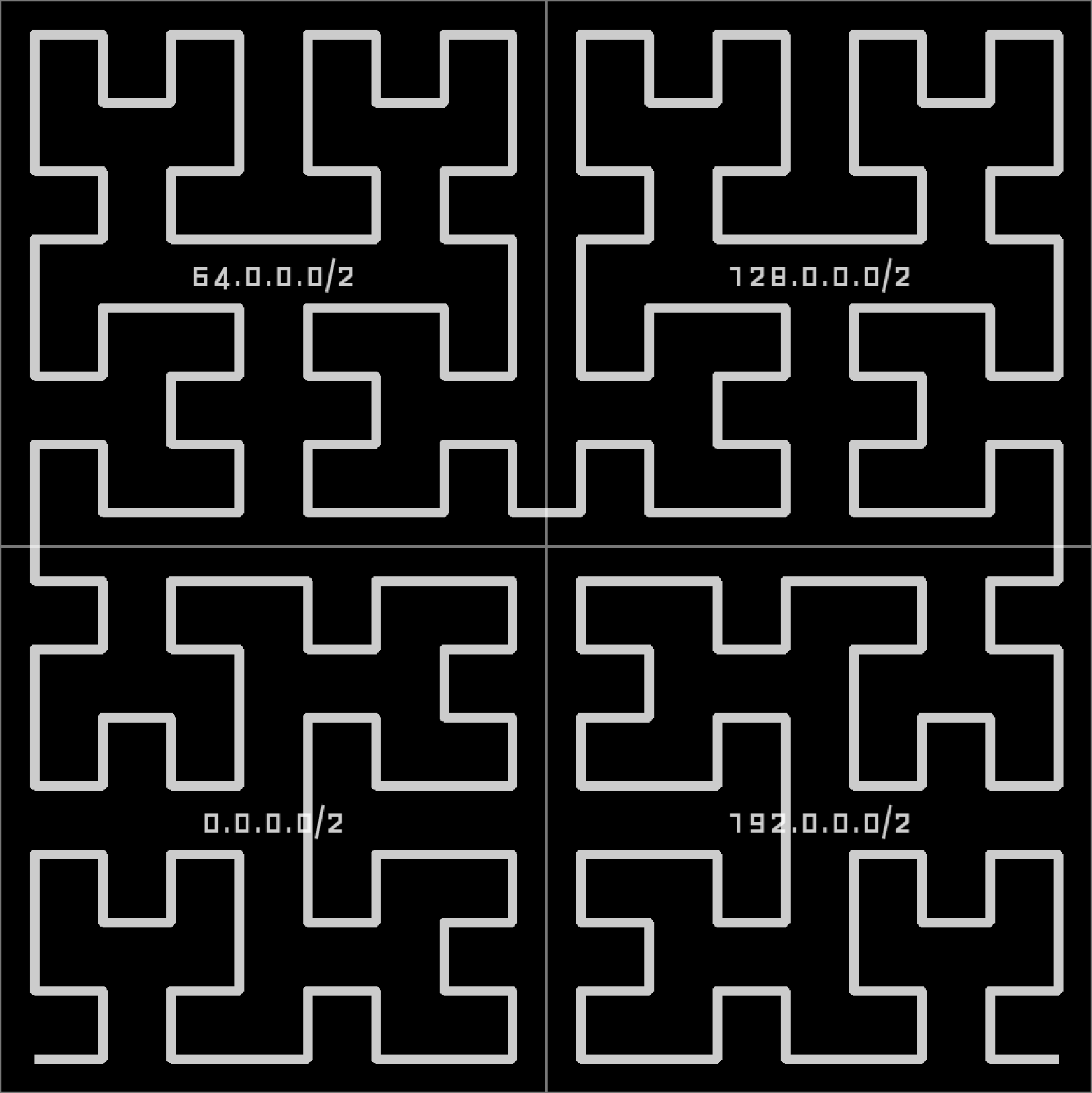
If we zoom in a little bit, we will see that 0.0.0.0/0 can actually be divided into four subnets: 0.0.0.0/2, 64.0.0.0/2, 128.0.0.0/2, and 192.0.0.0/2.
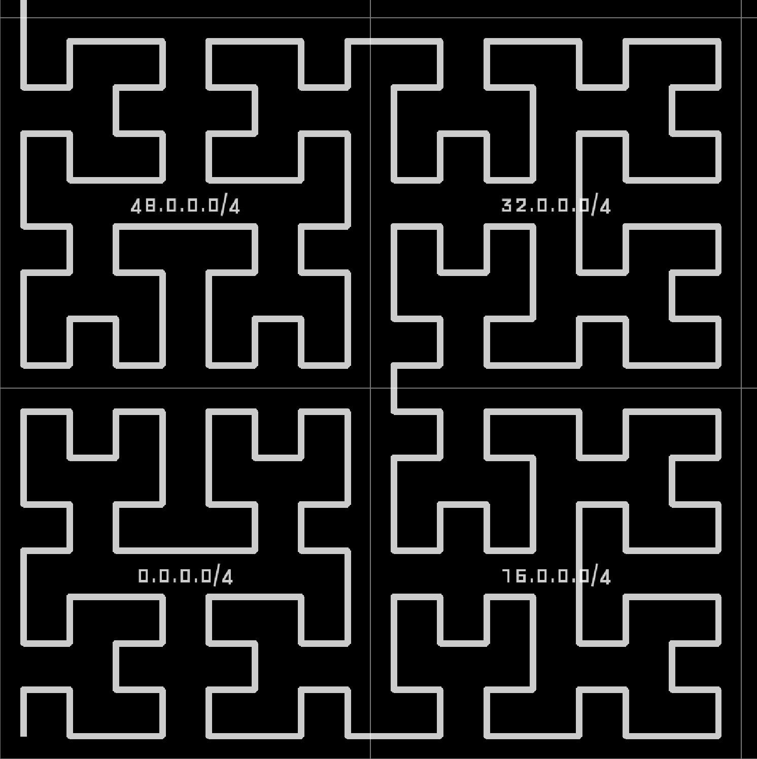
Zooming in further, in the lower right corner, we find that 0.0.0.0/2 actually consists of 0.0.0.0/4, 16.0.0.0/4, 32.0.0.0/4, and 48.0.0.0/4:
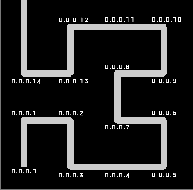
You see: every network covers some space on the entire curve and we can zoom in up until each point on the curve corresponds to a single IPv4 address:
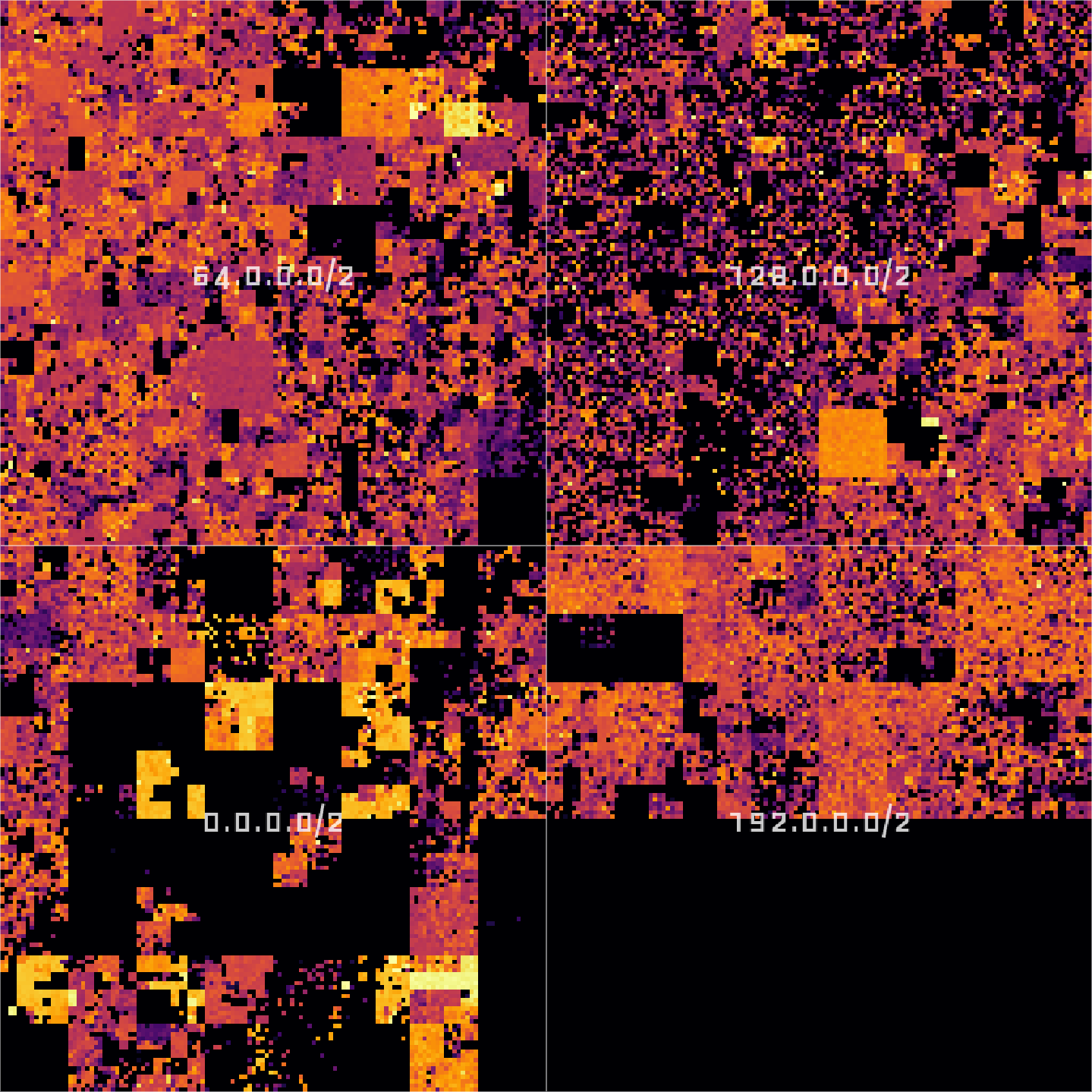
In my implementation I am visualizing the results of a port scan for a single port. All IP addresses where that port is open will be indicated as a bright spot on the map, all others will be left dark. And that is what the entire Internet looks like for TCP port 443 (used by HTTPS):
Implementation Link to heading
Going into detail here would exceed this post’s scope, but I implemented the frontend using Leaflet and the back-end tile server in Flask, served by uWSGI, running inside a Kubernetes pod hosted on Hetzner. I only assigned limited resources, so I expect some delays and/or the occasional Hug of Death.
The map is interactive and can be zoomed up to the /24 level. A click on the map brings up a popup containing GeoIP information from a database provided by IPLocate. One can choose between different datasets using a layer selector at the top right:
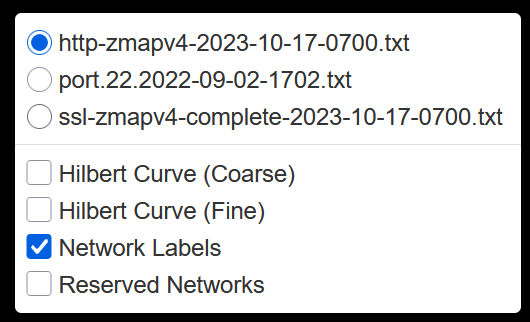
All layers are static. The datasets were published in Packed to the Brim: Analyzing Highly Responsive Prefixes on the Internet - Dataset by Patrick Sattler et al. of Technische Universität München (TUM) under the Creative Commons CC BY 4.0 License.
Exploration Link to heading
Now let’s dive into the data. Exploration is actually surprisingly fun and I want to show you some things to discover!
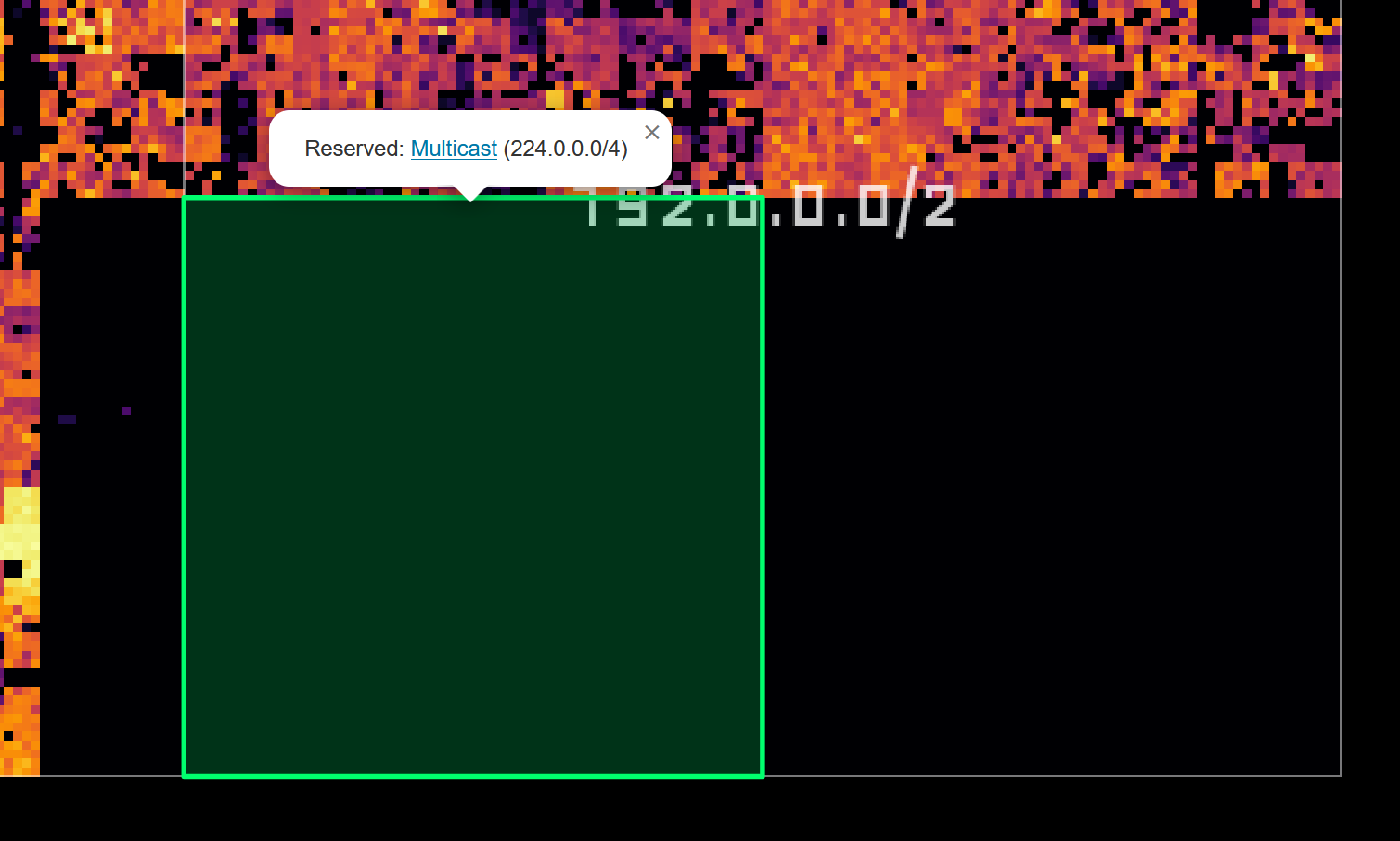
First, the big black block in the lower right corner: These are addresses reserved for multicast (224.0.0.0/4) and other (unspecified) purposes (240.0.0.0/4):
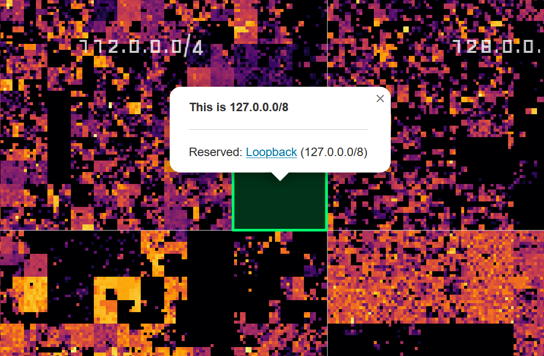
The little square almost dead center shows the loopback address space 127.0.0.0/8:
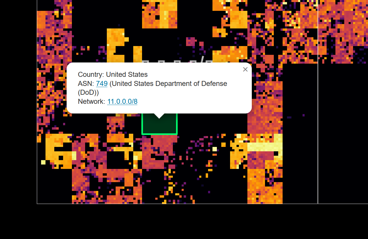
Many of the black patches in the lower left quadrant are networks belonging to the United States Department of Defense:
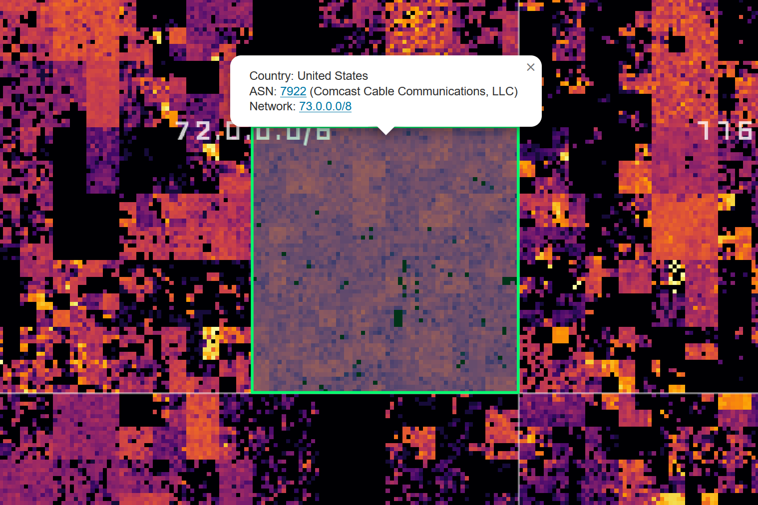
Zooming in further reveals smaller networks, such as this Comcast network, which is not especially bright, but surprisingly even:
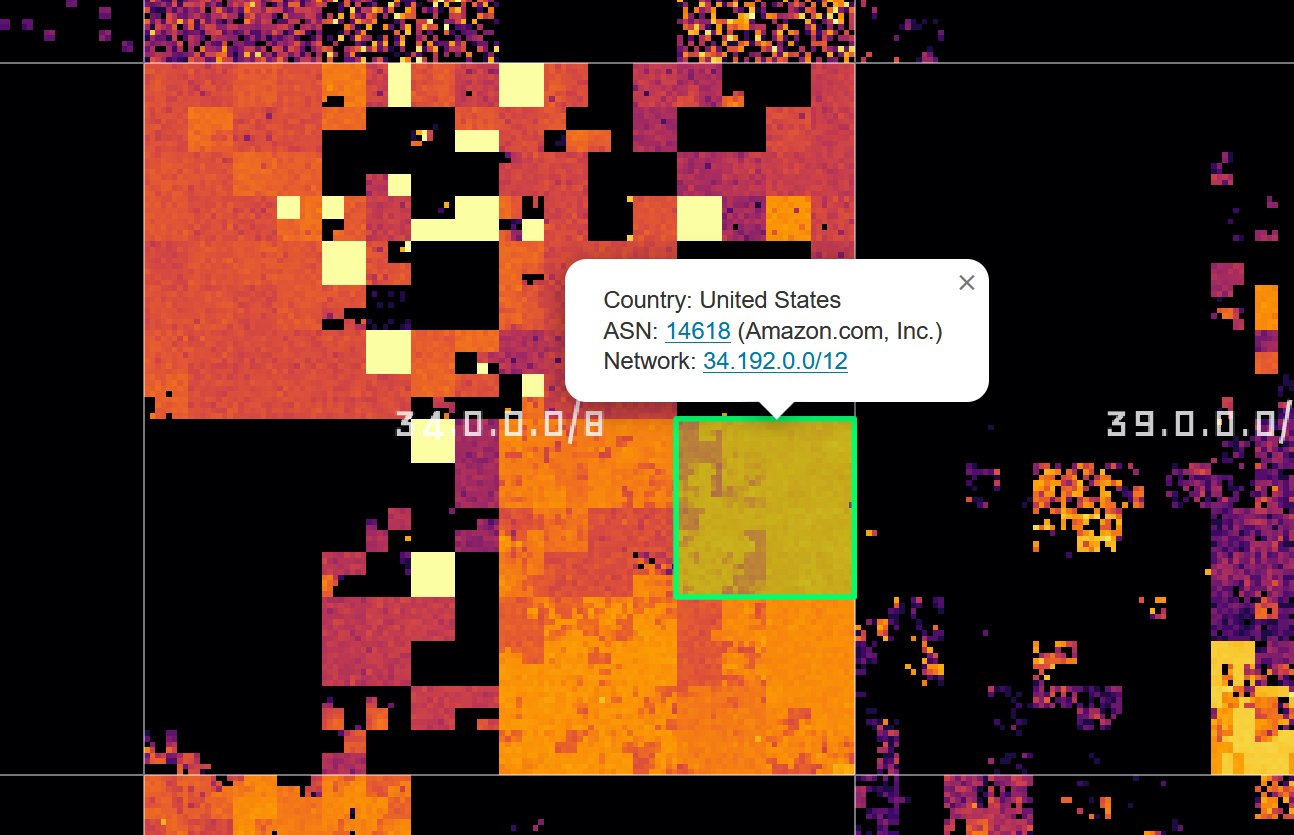
Companies that provide cloud services also light up very brightly, for example, Amazon/AWS:
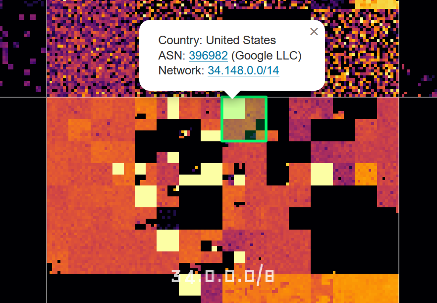
Or Google:
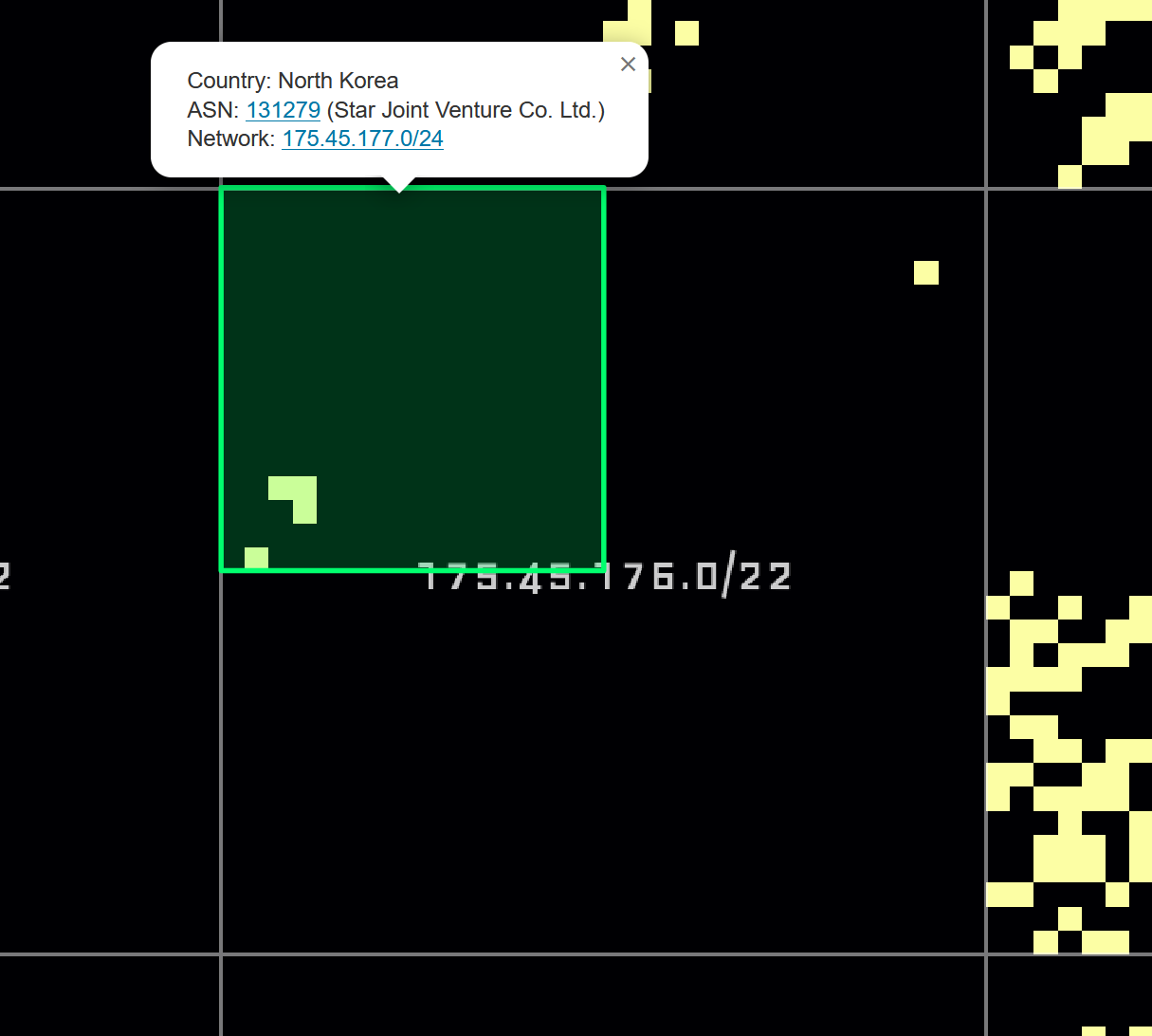
And finally, a rather quiet-looking network:
Closing Words Link to heading
I could (and have) spent hours browsing this map and I hope some of you find it interesting too! Be kind to the backend; it runs on limited resources. Other than that: have fun!
Visit the interactive Hilbert map at hilbert.app.jonaslieb.de